Authors: William Gearty & Lewis A. Jones
Last updated: 2026-07-08
Introduction
Herein we provide three example applications of the rphylopic package in combination with the ggplot2 package. However, note that all demonstrated functionality is also available for base R and showcased in a separate vignette.
Basic accession and transformation
The rphylopic package provides robust and flexible tools to access and transform PhyloPic silhouettes. Here we demonstrate this using the example dataset of Antarctic penguins from the palmerpenguins R package.
First, let’s load our libraries and the penguin data:
# Load libraries
library(rphylopic)
library(ggplot2)
library(palmerpenguins)
# Get penguin data and clean it
data(penguins)
penguins_subset <- subset(penguins, !is.na(sex))
Now, let’s pick a silhouette to use for the penguins. Let’s pick #2:
# Pick a silhouette for Pygoscelis (here we pick #2)
penguin <- pick_phylopic("Pygoscelis", n = 3, view = 3)
You may have noticed in the preview that the silhouette was a little slanted. Let’s rotate it clockwise just a smidgen:
# It's a little slanted, so let's rotate it a little bit
penguin_rot <- rotate_phylopic(img = penguin, angle = 15)
Now, let’s draft the plot that we want to make. In this case, let’s plot the penguins’ bill lengths vs. their flipper lengths:
ggplot(penguins_subset) +
  geom_point(aes(x = bill_length_mm, y = flipper_length_mm)) +
  labs(x = "Bill length (mm)", y = "Flipper length (mm)") +
  facet_wrap(~species, ncol = 1) +
  theme_bw(base_size = 15)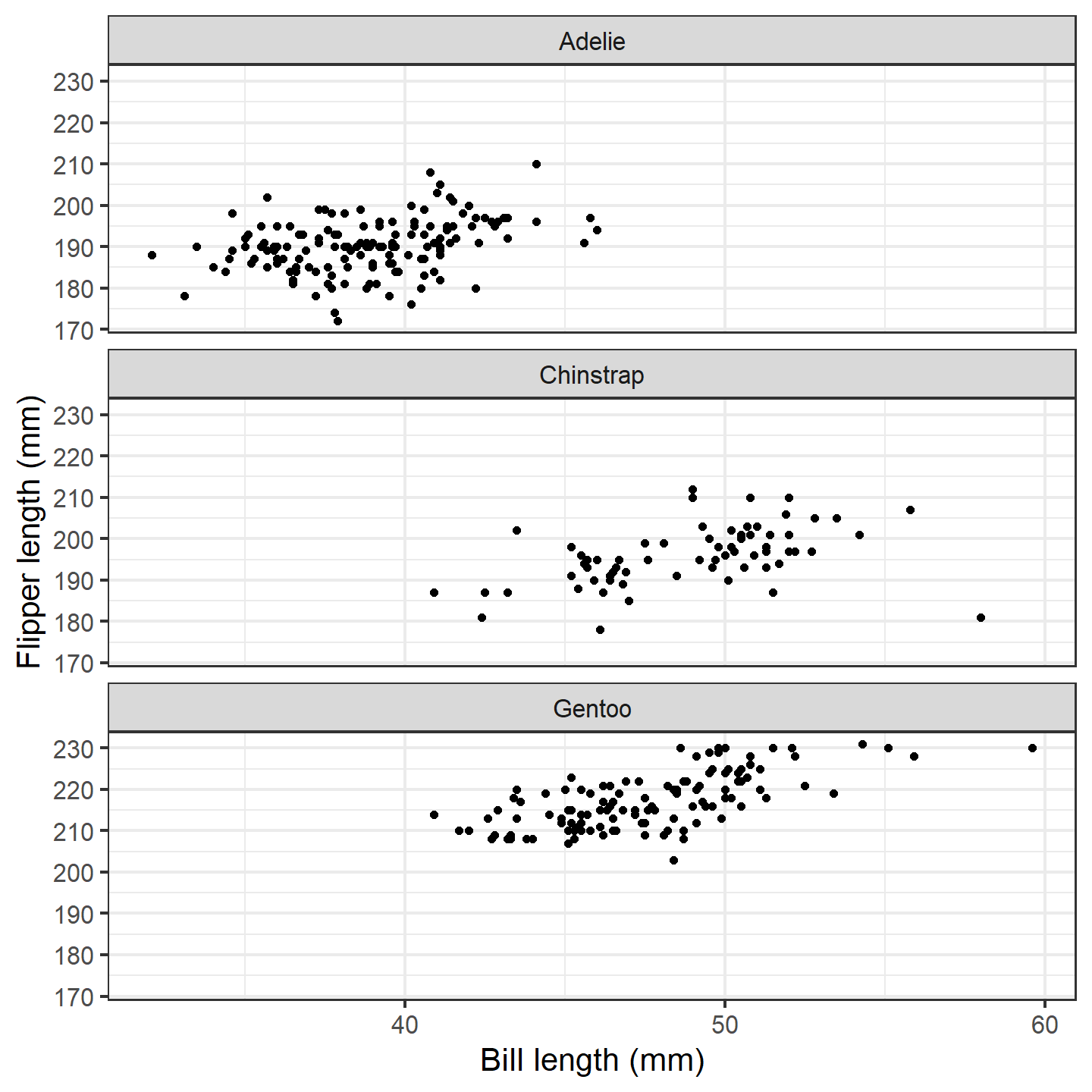
plot of chunk ggplot-penguin-plot-1
That’s a nice basic plot! But you know what would make it nicer? If
we added a penguin silhouette to the plot. Sadly, we don’t have a
different silhouette for each species (although we could make one…), so
let’s just go with putting a single silhouette in the top panel. We’ll
use the geom_phylopic() function, which will require us to
make a data.frame. Note that the x and
y aesthetics specify the center of the silhouette, and the
height argument specifies how tall the silhouette is in the
units of the y-axis.
silhouette_df <- data.frame(x = 59, y = 215, species = "Adelie")
ggplot(penguins_subset) +
  geom_point(aes(x = bill_length_mm, y = flipper_length_mm)) +
  geom_phylopic(data = silhouette_df, aes(x = x, y = y), height = 30,
                img = penguin_rot) +
  labs(x = "Bill length (mm)", y = "Flipper length (mm)") +
  facet_wrap(~species, ncol = 1) +
  theme_bw(base_size = 15)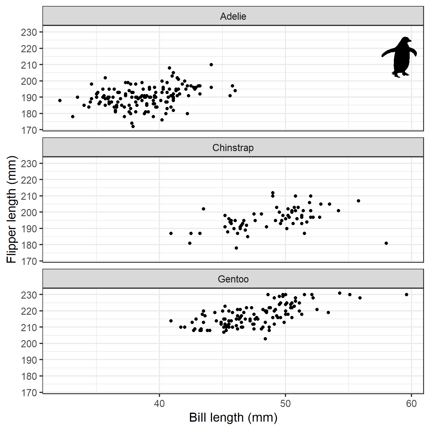
plot of chunk ggplot-penguin-plot-2
Isn’t that nifty! We can go a step further, though. What if we used
little penguins instead of points?! To do that, we can use the
geom_phylopic() function instead of the
geom_point() function (in this case, we want to use the
same image for each x-y pair):
ggplot(penguins_subset) +
  geom_phylopic(img = penguin_rot,
                aes(x = bill_length_mm, y = flipper_length_mm)) +
  labs(x = "Bill length (mm)", y = "Flipper length (mm)") +
  facet_wrap(~species, ncol = 1) +
  theme_bw(base_size = 15)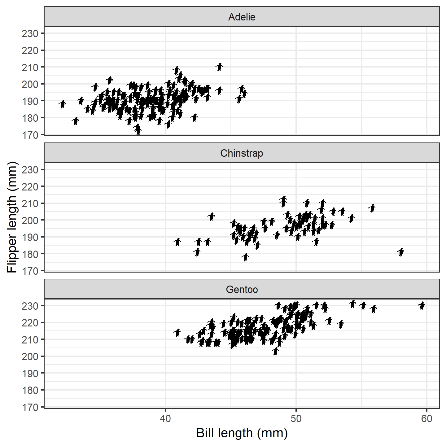
plot of chunk ggplot-penguin-plot-3
The default silhouette size for geom_phylopic() is as
large as will fit within the plot area. That won’t work well here.
Instead, we can specify a height or width to
use (in y-axis or x-axis units, respectively):
ggplot(penguins_subset) +
  geom_phylopic(img = penguin_rot,
                aes(x = bill_length_mm, y = flipper_length_mm), height = 5) +
  labs(x = "Bill length (mm)", y = "Flipper length (mm)") +
  facet_wrap(~species, ncol = 1) +
  theme_bw(base_size = 15)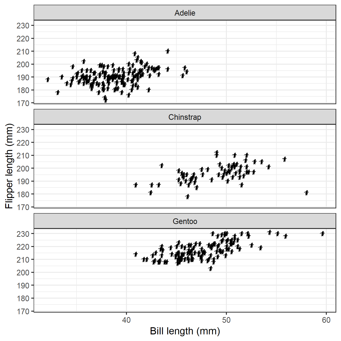
plot of chunk ggplot-penguin-plot-3b
Alternatively, we can vary the height based on some other aspect of
data, and the values will be automatically scaled for us. In this case,
let’s try making the size of the silhouettes relative to the penguins’
body masses. Behind the scenes, rphylopic will work its
magic and rescale them to values between 1 and 6. Note that, depending
on your own data, you may want to customize how the values are scaled by
using scale_height_continuous() (or
scale_width_continuous() if you are using the
width aesthetic) just as you would use
scale_size_continuous(). We’ll just use the defaults
here:
ggplot(penguins_subset) +
  geom_phylopic(img = penguin_rot,
                aes(x = bill_length_mm, y = flipper_length_mm,
                    height = body_mass_g)) +
  labs(x = "Bill length (mm)", y = "Flipper length (mm)") +
  facet_wrap(~species, ncol = 1) +
  theme_bw(base_size = 15)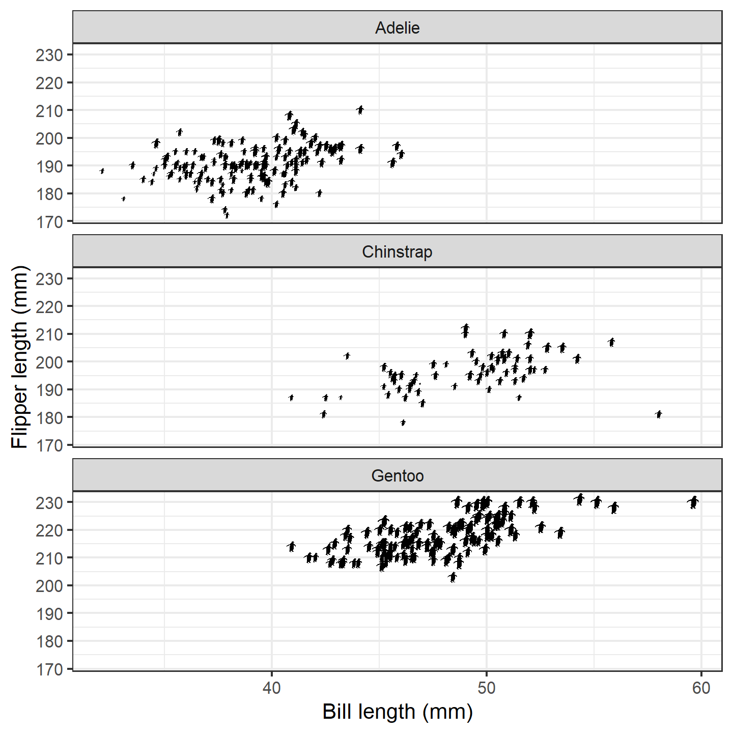
plot of chunk ggplot-penguin-plot-4
Nice! Finally, let’s give the female and male penguins different fill
colors. Note that the default for geom_phylopic() is to not
display a legend, so we need to set show.legend = TRUE.
However, we only want a legend for the fill colors, so we use
guide = "none" for the size scale. We also want to show the
fill color in the legend, so we need to override the shape:
ggplot(penguins_subset) +
  geom_phylopic(img = penguin_rot,
                aes(x = bill_length_mm, y = flipper_length_mm,
                    height = body_mass_g, fill = sex),
                show.legend = TRUE) +
  labs(x = "Bill length (mm)", y = "Flipper length (mm)") +
  scale_size_continuous(guide = "none") +
  scale_fill_manual("Sex", values = c("orange", "blue"),
                    labels = c("Female", "Male"),
                    guide = guide_legend(override.aes = list(shape = 21))) +
  facet_wrap(~species, ncol = 1) +
  theme_bw(base_size = 15) +
  theme(legend.position = "inside", legend.position.inside = c(0.9, 0.9))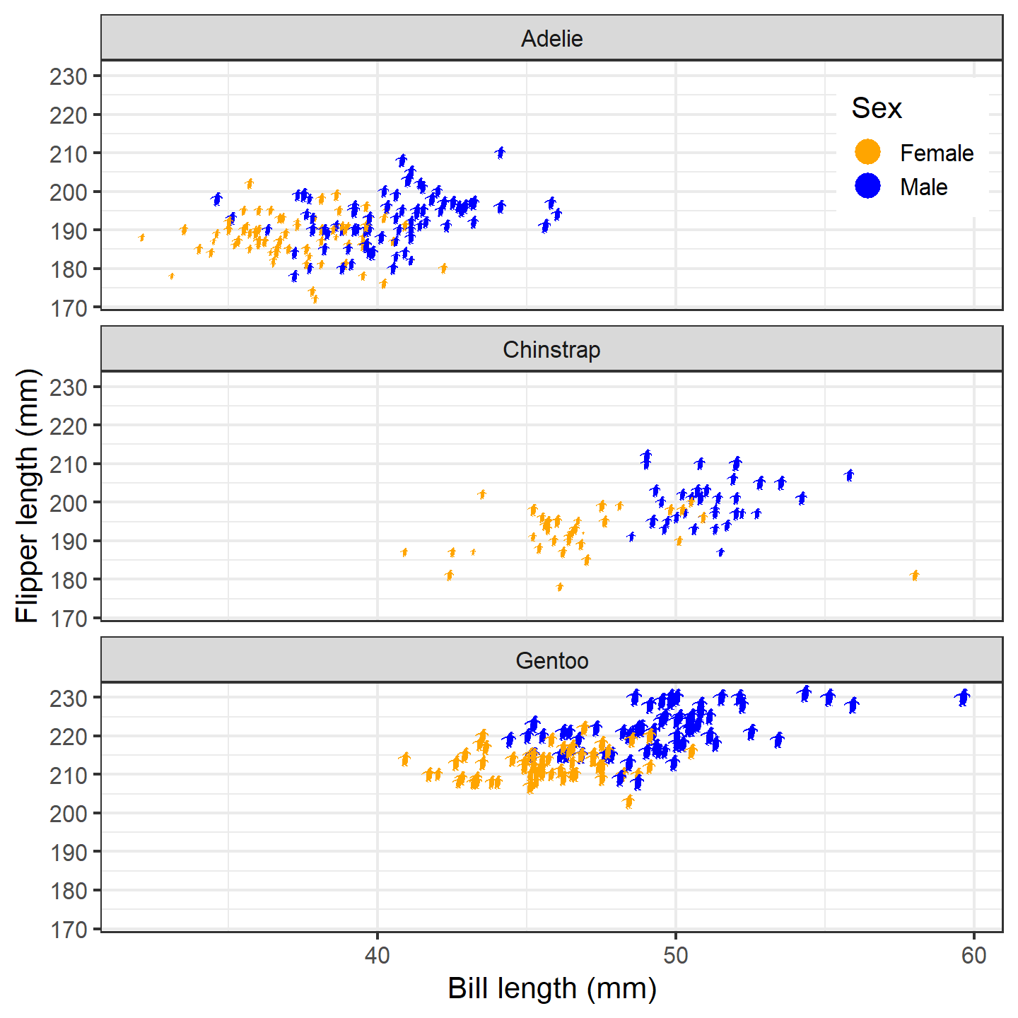
plot of chunk ggplot-penguin-plot-5
Hmm…the colored dots in the legend are great, but lucky for us, the
package also supplies a convenient way to include silhouettes in the
legend. Due to technical constraints, you’ll need to specify the
images/uuids/names again within phylopic_key_glyph(). If
you supply more than one silhouette to this function, it will cycle
through them as it generates legend keys (recycling as needed). Note
that phylopic_key_glyph() does not currently support the
height/width aesthetics.
ggplot(penguins_subset) +
  geom_phylopic(img = penguin_rot,
                aes(x = bill_length_mm, y = flipper_length_mm,
                    height = body_mass_g, fill = sex),
                show.legend = TRUE,
                key_glyph = phylopic_key_glyph(img = penguin_rot)) +
  labs(x = "Bill length (mm)", y = "Flipper length (mm)") +
  scale_size_continuous(guide = "none") +
  scale_fill_manual("Sex", values = c("orange", "blue"),
                    labels = c("Female", "Male")) +
  facet_wrap(~species, ncol = 1) +
  theme_bw(base_size = 15) +
  theme(legend.position = "inside", legend.position.inside = c(0.9, 0.9))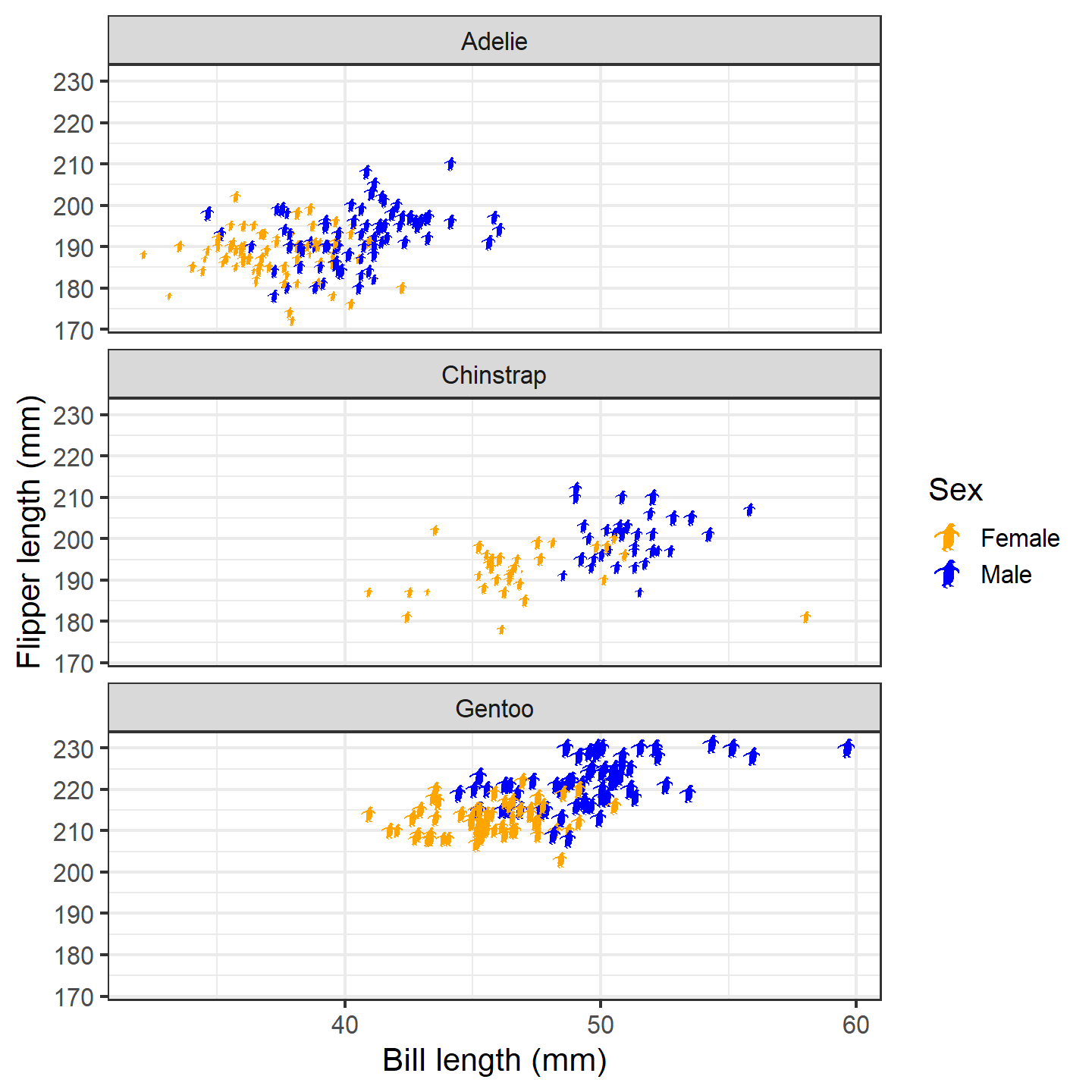
plot of chunk ggplot-penguin-plot-6
Now that’s a nice figure!
Geographic distribution
In much the same way as generic x-y plotting, the rphylopic package can be used in combination with ggplot2 to plot organism silhouettes on a map. That is, to plot data points (e.g., species occurrences) as silhouettes. We provide an example here of how this might be achieved. For this application, we use the example occurrence dataset of early (Carboniferous to Early Triassic) tetrapods from the palaeoverse R package to visualize the geographic distribution of Diplocaulus fossils.
First, let’s load our libraries and the tetrapod data:
# Load libraries
library(rphylopic)
library(ggplot2)
library(palaeoverse)
library(sf)
library(maps)
# Get occurrence data
data(tetrapods)
Then we’ll subset our occurrences to only those for Diplocaulus:
# Subset to desired group
tetrapods <- subset(tetrapods, genus == "Diplocaulus")
Now, let’s plot those occurrences on a world map.
ggplot2 and it’s built-in function
map_data() make this a breeze. Note that we use
alpha = 0.75 in case there are multiple occurrences in the
same place. That way, the darker the fill color, the more occurrences in
that geographic location.
# Get map data
world <- st_as_sf(map("world", fill = TRUE, plot = FALSE))
world <- st_wrap_dateline(world)
# Make map
ggplot(world) +
  geom_sf(fill = "lightgray", color = "darkgrey", linewidth = 0.1) +
  geom_point(data = tetrapods, aes(x = lng, y = lat),
             height = 4, alpha = 0.75, fill = "blue") +
  theme_void() +
  coord_sf()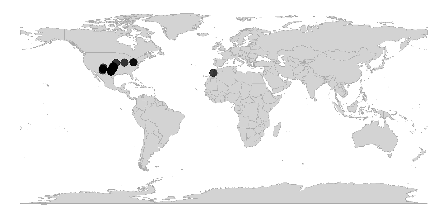
plot of chunk ggplot-geog-plot-1
Now, as with the penguin figure above, we can easily replace those points with silhouettes.
ggplot(world) +
  geom_sf(fill = "lightgray", color = "darkgrey", linewidth = 0.1) +
  geom_phylopic(data = tetrapods, aes(x = lng, y = lat, name = genus),
                height = 4, alpha = 0.75, fill = "blue") +
  theme_void() +
  coord_sf()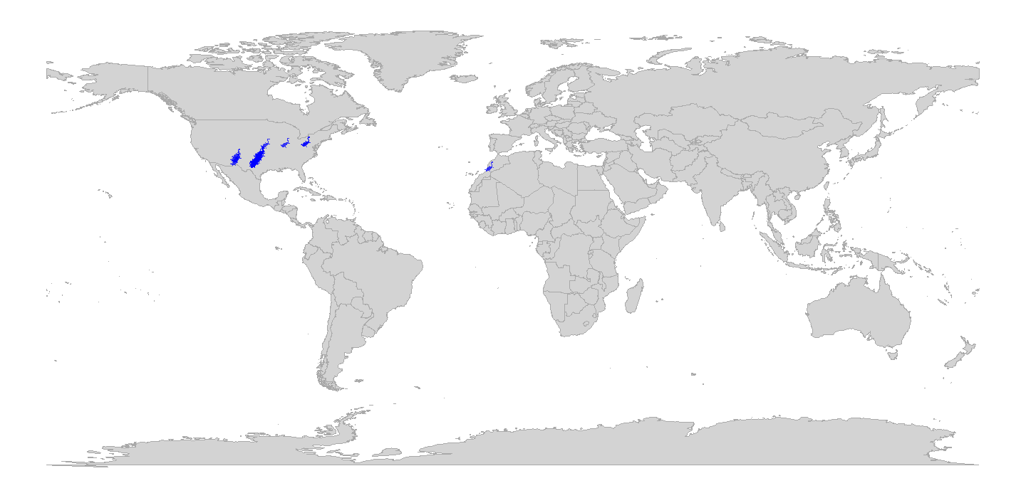
plot of chunk ggplot-geog-plot-2
Snazzy!
Note that while we used the genus name as the name
aesthetic here, we easily could have done
name = "Diplocaulus" outside of the aes() call
instead. However, if we were plotting occurrences of multiple genera,
we’d definitely want to plot them as different silhouettes using
name = genus within the aes() call.
Also, note that we could change the projection of the map and data
using the crs and default_crs arguments in
coord_sf(). When projecting data, note that the y-axis
limits will change to projected limits. For example, in the Robinson
projection, the y-axis limits are roughly -8,600,000 and 8,600,000 in
projected coordinates. Therefore, you may need to adjust the
height argument/aesthetic accordingly when projecting maps
and data.
# Set up a bounding box
bbox <- st_graticule(crs = st_crs("ESRI:54030"),
                     lat = c(-89.9, 89.9), lon = c(-179.9, 179.9))
ggplot(world) +
  geom_sf(fill = "lightgray", color = "darkgrey", linewidth = 0.1) +
  geom_phylopic(data = tetrapods, aes(x = lng, y = lat, name = genus),
                height = 4E5, alpha = 0.75, fill = "blue") +
  geom_sf(data = bbox) +
  theme_void() +
  coord_sf(default_crs = st_crs(4326), crs = st_crs("ESRI:54030"))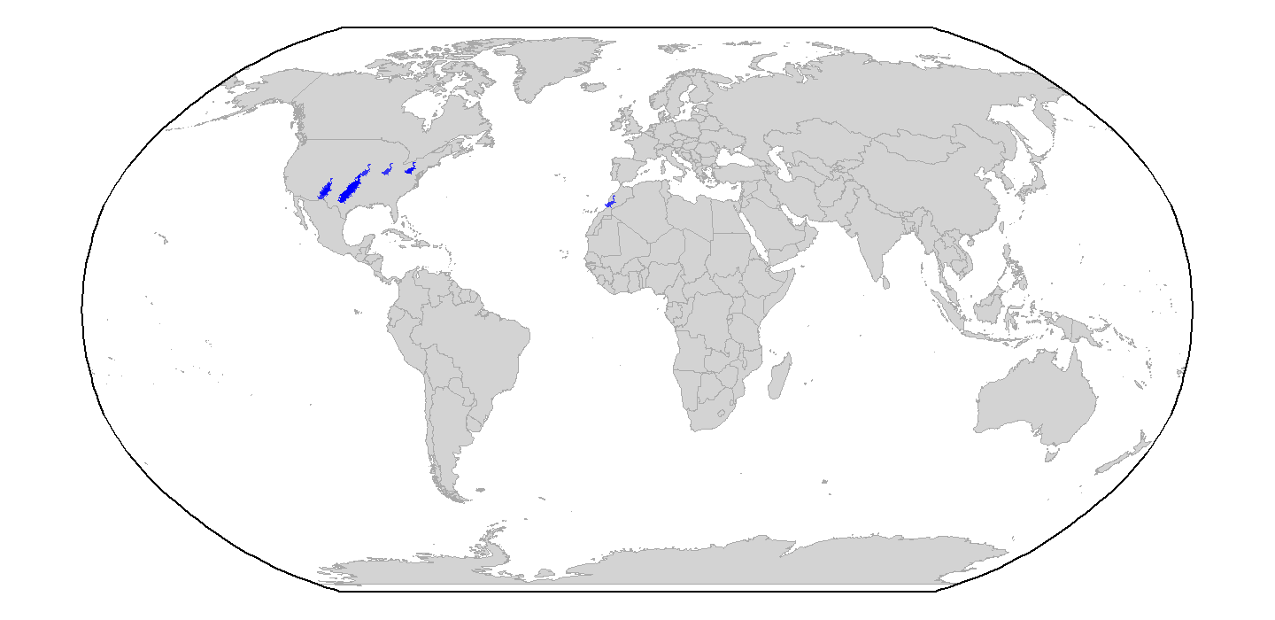
plot of chunk ggplot-geog-plot-3
Phylogenetics
Another common use case of PhyloPic silhouettes is to represent taxonomic information. In this example, we demonstrate how to use silhouettes within a phylogenetic framework. In this case, the phylogeny, taken from the phytools package, includes taxa across all vertebrates. Even many taxonomic experts are unlikely to know the scientific names of these 11 disparate taxa, so we’ll replace the names with PhyloPic silhouettes. First, let’s load our libraries and data:
# Load libraries
library(rphylopic)
library(ggplot2)
library(phytools)
# Get vertebrate phylogeny and data
data(vertebrate.tree)
We can use a vectorized version of the get_uuid()
function to retrieve UUID values for all of the species at once.
However, just in case we get an error, we wrap the
get_uuid() call in a tryCatch() call. This
way, we should get either a UUID or NA for each
species:
# Make a data.frame for the PhyloPic names
vertebrate_data <- data.frame(species = vertebrate.tree$tip.label, uuid = NA)
# Try to get PhyloPic UUIDs for the species names
vertebrate_data$uuid <- sapply(vertebrate.tree$tip.label,
                               function(x) {
                                 tryCatch(get_uuid(x), error = function(e) NA)
                               })
vertebrate_data
## species uuid
## 1 Carcharodon_carcharias 00f208a3-887d-4ae8-838c-2124f53b9fc1
## 2 Carassius_auratus abcb9d2c-db21-4b63-b8e7-b770b11ad288
## 3 Latimeria_chalumnae 12c38a8a-6d68-4af3-ada3-05cafdfc25c2
## 4 Homo_sapiens 9c6af553-390c-4bdd-baeb-6992cbc540b1
## 5 Lemur_catta 8a187391-82a3-4d9b-a402-3a310bf7dc38
## 6 Myotis_lucifugus <NA>
## 7 Sus_scrofa 14a64a2f-166e-4bb4-b108-adc085cbcb7a
## 8 Megaptera_novaeangliae 012afb33-55c3-4fc6-9ae3-3a91fda32fd5
## 9 Bos_taurus dc5c561e-e030-444d-ba22-3d427b60e58a
## 10 Iguana_iguana 5dec03d9-66a2-4033-b1a9-6dbb3485199f
## 11 Turdus_migratorius 83b29bf0-f4f9-412d-8b3b-7faf4febd69dOh no, we weren’t able to find a silhouette for Myotis
lucifugus (little brown bat)! Good thing we used
tryCatch()! Given the coarse resolution of this phylogeny,
we can just grab a silhouette for the subfamily (Vespertilioninae):
vertebrate_data$uuid[vertebrate_data$species == "Myotis_lucifugus"] <-
  get_uuid("Vespertilioninae")
I’m also not a huge fan of the boar picture. Let’s choose an
alternative with pick_phylopic().
# Pick a different boar image; we'll pick #4
boar_svg <- pick_phylopic("Sus scrofa", view = 5)
# Extract the UUID
vertebrate_data$uuid[vertebrate_data$species == "Sus_scrofa"] <-
  attr(boar_svg, "uuid")
Now that we’ve got our phylogeny and UUIDs, we could go ahead and
create our figure. However, time for a quick aside. The time required
for geom_phylopic() and the other
rphylopic visualization functions scales with the
number of unique names/UUIDs, not the number of plotted
silhouettes. Therefore, if you are plotting a lot of different
silhouettes, these functions can take quite a long time to poll PhyloPic
for each unique name, download the silhouettes, and convert them to be
added to the plot. If you plan to use the same silhouettes for multiple
figures, we strongly suggest that you poll PhyloPic yourself using
get_phylopic() or pick_phylopic(), save the
silhouettes to your R environment, and then these use image objects in
the visualization functions (with the img
argument/aesthetic). Following this advice, let’s get image objects for
these 11 species before we make our figure. Note that, since we’ve used
get_uuid() to get these 11 UUIDs, we know that they are
valid, so we don’t need to catch any errors this time.
vertebrate_data$svg <- lapply(vertebrate_data$uuid, get_phylopic)Now let’s go ahead and plot our phylogeny with the ggtree package:
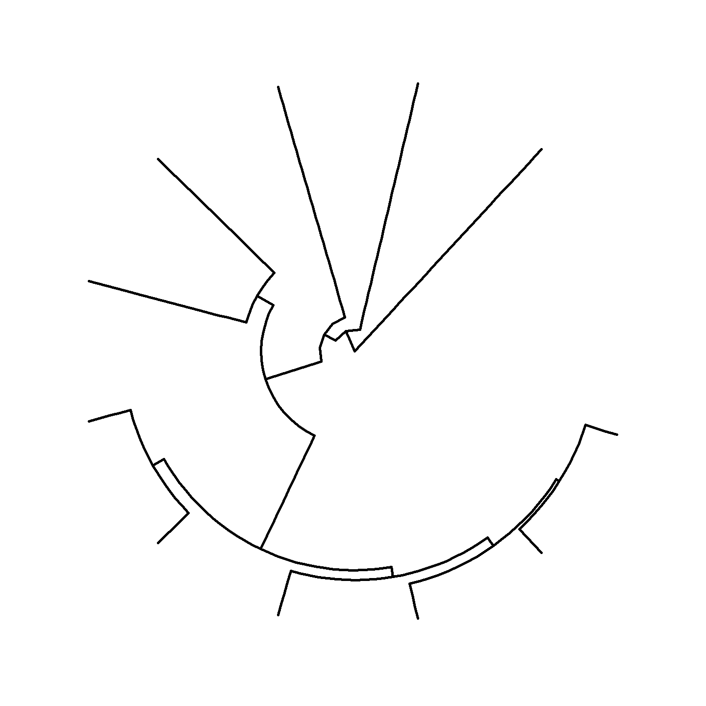
plot of chunk ggplot-phylo-plot-1
Hmm…that’s a bit boring. Let’s add a geological timescale to the
background using coord_geo_polar() from the
deeptime package. Note that we need to use the
revts() function to reverse the time axis to work with
coord_geo_polar().
library(deeptime)
# Plot the tree with a geological timescale in the background
revts(ggtree(vertebrate.tree, linewidth = 1)) +
  scale_x_continuous(breaks = seq(-500, 0, 100),
                     labels = seq(500, 0, -100),
                     limits = c(-500, 0),
                     expand = expansion(mult = 0)) +
  scale_y_continuous(guide = NULL) +
  coord_geo_radial(dat = "periods") +
  theme_classic()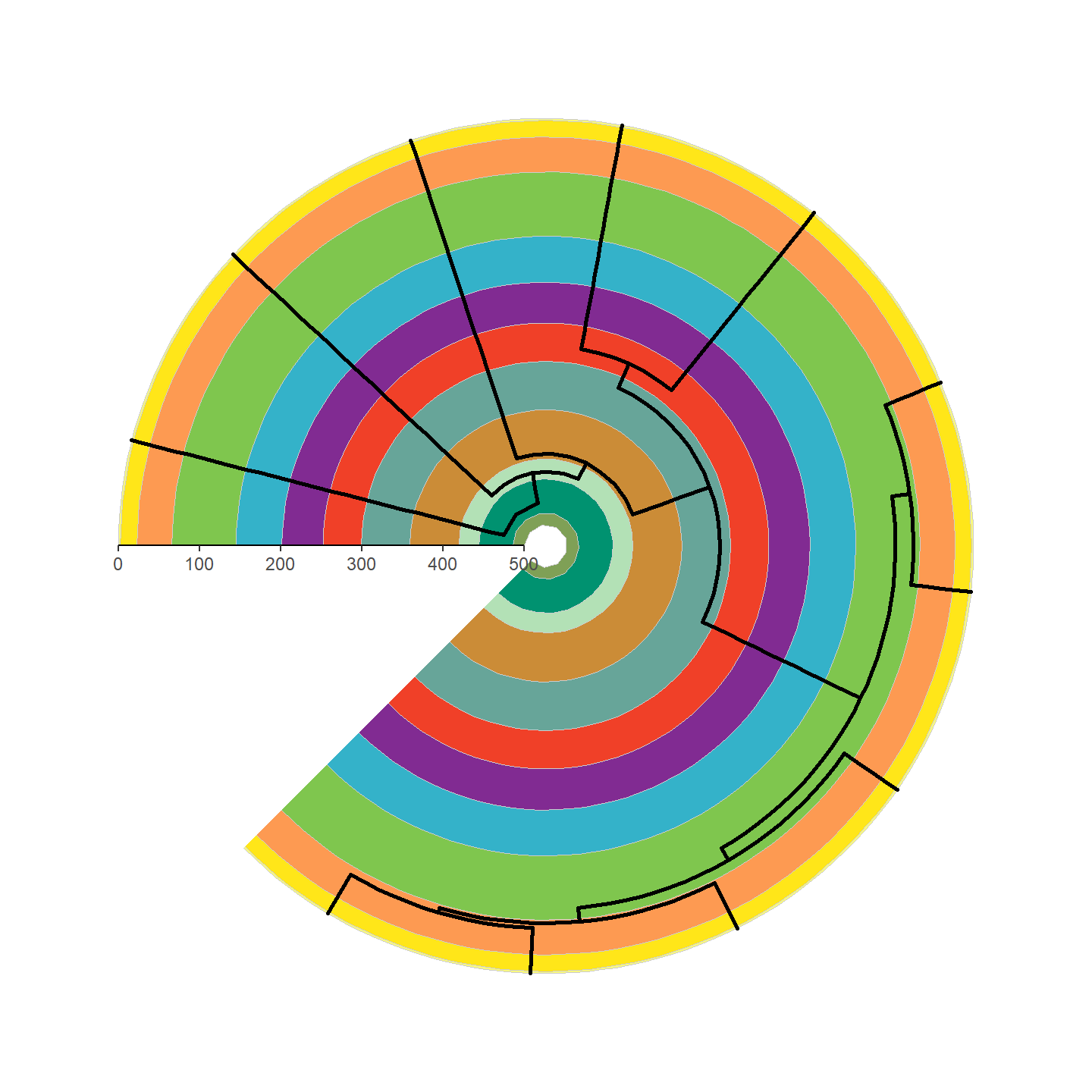
plot of chunk ggplot-phylo-plot-2
That’s looking a lot prettier! Let’s go ahead and add our silhouettes
now. Note that we need to attach the vertebrate_data object
with the %<+% operator from ggtree.
revts(ggtree(vertebrate.tree, linewidth = 1)) %<+% vertebrate_data +
  geom_phylopic(aes(img = svg), height = 25) +
  scale_x_continuous(breaks = seq(-500, 0, 100),
                     labels = seq(500, 0, -100),
                     limits = c(-500, 0),
                     expand = expansion(mult = 0)) +
  scale_y_continuous(guide = NULL) +
  coord_geo_radial(dat = "periods") +
  theme_classic()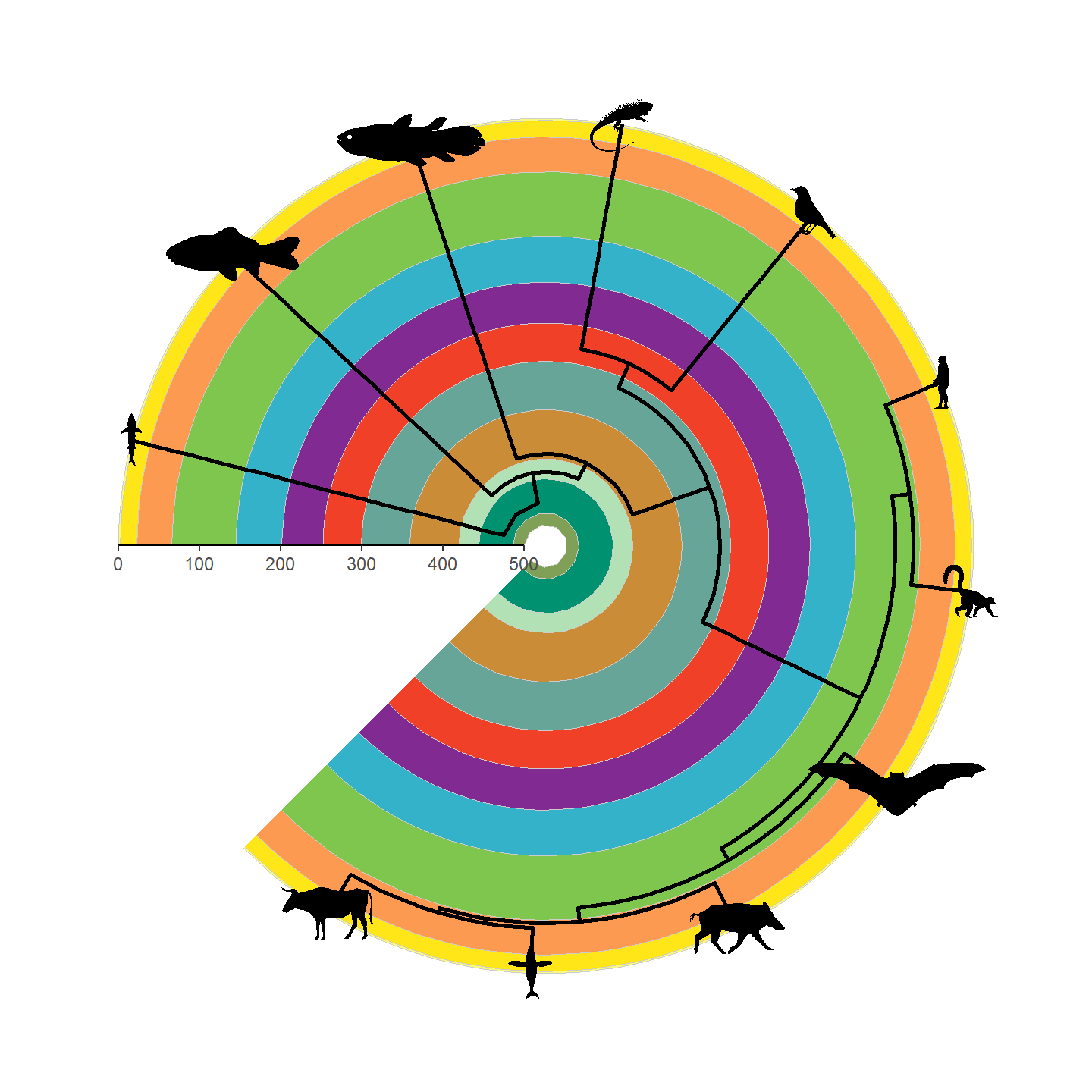
plot of chunk ggplot-phylo-plot-3
Note that only a single height is specified and aspect ratio is always maintained, hence why the silhouettes all have the same height but different widths. Let’s fix some of the silhouettes by rotating them 90 degrees:
vertebrate_data$svg[[1]] <- rotate_phylopic(img = vertebrate_data$svg[[1]])
vertebrate_data$svg[[8]] <- rotate_phylopic(img = vertebrate_data$svg[[8]])
And now the finished product:
revts(ggtree(vertebrate.tree, linewidth = 1)) %<+% vertebrate_data +
  geom_phylopic(aes(img = svg), height = 25) +
  scale_x_continuous(breaks = seq(-500, 0, 100),
                     labels = seq(500, 0, -100),
                     limits = c(-500, 0),
                     expand = expansion(mult = 0)) +
  scale_y_continuous(guide = NULL) +
  coord_geo_radial(dat = "periods") +
  theme_classic()
plot of chunk ggplot-phylo-plot-4
Beautiful!
Network plots
The ggraph package extends ggplot2 to
network graphs and geom_phylopic() can be dropped into a
ggraph() plot to render nodes as PhyloPic silhouettes. This
is particularly useful for visualizing food webs, taxonomic networks, or
other graph-structured data where the nodes represent organisms.
Let’s demonstrate with a simple Permian food web. First, we set up the network:
# Load libraries
library(rphylopic)
library(ggplot2)
library(igraph)
library(ggraph)
# Define a simple food web among Permian tetrapods and a Permian fish
food_web <- data.frame(
  from = c("Eryops", "Diplocaulus", "Diplocaulus", "Eryops"),
  to   = c("Dimetrodon", "Dimetrodon",
           "Xenacanthus decheni", "Xenacanthus decheni")
)
g <- graph_from_data_frame(food_web, directed = TRUE)
Each vertex name in g corresponds to a taxonomic name we
can pass to PhyloPic. Because geom_phylopic() accepts the
name aesthetic, we can map vertex names directly to
silhouettes. The x and y aesthetics are also
inherited from the ggraph initialization, but still need to
be defined explicitly.
set.seed(42)
ggraph(g, layout = "stress") +
  geom_edge_link(arrow = arrow(length = unit(5, "mm"), type = "closed"),
                 end_cap = circle(15, "mm"),
                 color = "darkgrey") +
  geom_phylopic(aes(x = x, y = y, name = name), height = 0.15) +
  scale_x_continuous(expand = expansion(mult = 0.3)) +
  scale_y_continuous(expand = expansion(mult = 0.3)) +
  theme_void()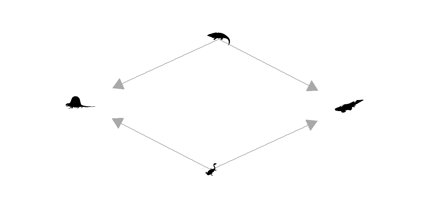
plot of chunk ggplot-network-plot-1
A couple things are worth noting here. First, the height
value is in the units of the layout coordinates, which for a stress
layout typically span roughly -1 to 1; you may need to adjust this for
different layouts (e.g., layout = "kk" or
layout = "fr" produce different coordinate ranges). Second,
we use end_cap = circle(15, "mm") on the edges so the
arrowheads stop just outside each silhouette rather than overlapping
them; this value needs to be tuned to roughly match your silhouette
height.