Authors: William Gearty & Lewis A. Jones
Last updated: 2026-07-08
Introduction
Herein we provide three example applications of the rphylopic package using base R. However, note that all demonstrated functionality is also available for use with the ggplot2 package and showcased in a separate vignette.
Basic accession and transformation
The rphylopic package provides robust and flexible tools to access and transform PhyloPic silhouettes. Here we demonstrate this using the example dataset of Antarctic penguins from the palmerpenguins R package.
First, let’s load our libraries and the penguin data:
# Load libraries
library(rphylopic)
library(palmerpenguins)
# Get penguin data
data(penguins)
Now, let’s pick a silhouette to use for the penguins. Let’s pick #2:
# Pick a silhouette for Pygoscelis (here we pick #2)
penguin <- pick_phylopic("Pygoscelis", n = 3, view = 3)
You may have noticed in the preview that the silhouette was a little slanted. Let’s rotate it clockwise just a smidgen:
# It's a little slanted, so let's rotate it a little bit
penguin_rot <- rotate_phylopic(img = penguin, angle = 15)
Now, let’s clean the data and split the data among the three species:
# Subset the data to remove rows with missing sex values
penguins_subset <- subset(penguins, !is.na(sex))
# Split the data by species
species_split <- split(penguins_subset, penguins_subset$species)
Now we’re going to make a three panel plot, one panel for each species. Within each panel, we’ll plot the penguins’ bill lengths vs. their flipper lengths:
# Set up the plot area
par(mfrow = c(3, 1), mar = c(4, 4, 2, 1))

# Loop over the species and create a plot for each one
for (i in seq_along(species_split)) {
  species_data <- species_split[[i]]
  plot(x = species_data$bill_length_mm, y = species_data$flipper_length_mm,
       xlab = "Bill length (mm)", ylab = "Flipper length (mm)",
       main = names(species_split)[i],
       xlim = range(penguins_subset$bill_length_mm, na.rm = TRUE),
       ylim = range(penguins_subset$flipper_length_mm, na.rm = TRUE))
}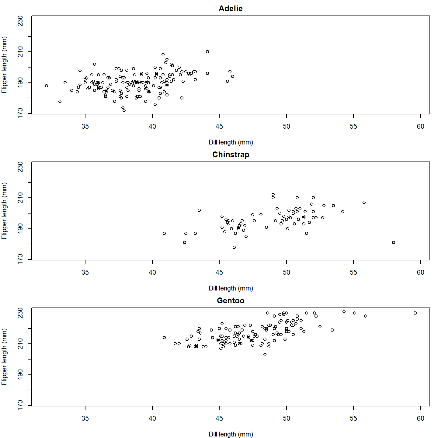
plot of chunk base-penguin-plot-1
That’s a nice basic plot! But you know what would make it nicer? If
we added a penguin silhouette to the plot. Sadly, we don’t have a
different silhouette for each species (although we could make one…), so
let’s just go with putting a single silhouette in the top panel. To do
that, we can use the add_phylopic_base() function. Note
that the x and y arguments specify the center
of the silhouette, and the height argument specifies how
tall the silhouette is in the units of the y-axis.
# Set up the plot area
par(mfrow = c(3, 1), mar = c(4, 4, 2, 1))

# Loop over the species and create a plot for each one
for (i in seq_along(species_split)) {
  species_data <- species_split[[i]]
  plot(x = species_data$bill_length_mm, y = species_data$flipper_length_mm,
       xlab = "Bill length (mm)", ylab = "Flipper length (mm)",
       main = names(species_split)[i],
       xlim = range(penguins_subset$bill_length_mm, na.rm = TRUE),
       ylim = range(penguins_subset$flipper_length_mm, na.rm = TRUE))
  if (i == 1) add_phylopic_base(img = penguin_rot, x = 59, y = 215, height = 30)
}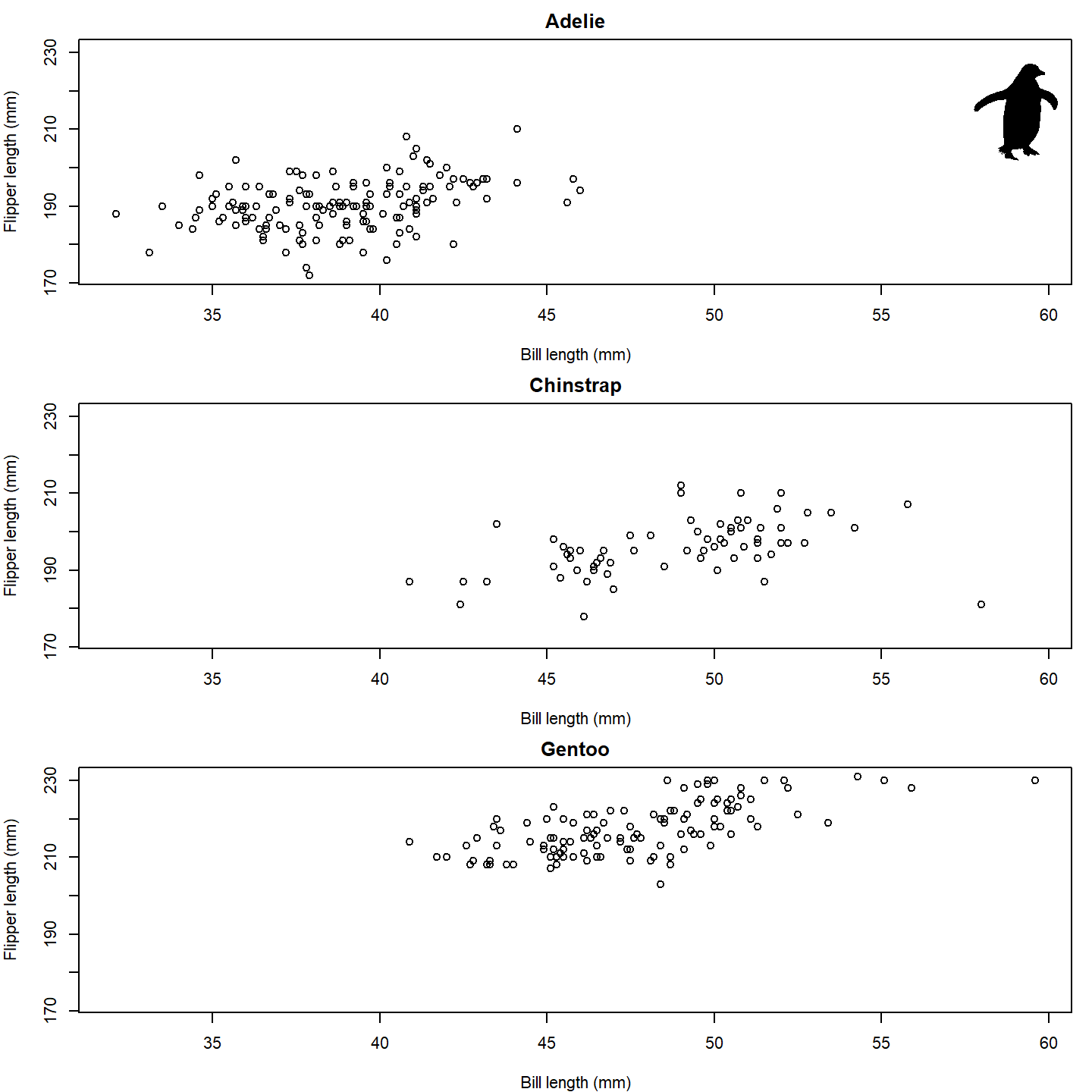
plot of chunk base-penguin-plot-2
Isn’t that nifty! We can go a step further, though. What if we used
little penguins instead of points?! To do that, we can once again use
the add_phylopic_base() function. In this case, we can
again specify img = penguin_rot since we want to use the
same image for each x-y pair:
# Set up the plot area
par(mfrow = c(3, 1), mar = c(4, 4, 2, 1))

# Loop over the species and create a plot for each one
for (i in seq_along(species_split)) {
  species_data <- species_split[[i]]
  plot(NA, xlab = "Bill length (mm)", ylab = "Flipper length (mm)",
       main = names(species_split)[i],
       xlim = range(penguins_subset$bill_length_mm, na.rm = TRUE),
       ylim = range(penguins_subset$flipper_length_mm, na.rm = TRUE))
  add_phylopic_base(img = penguin_rot,
                    x = species_data$bill_length_mm,
                    y = species_data$flipper_length_mm)
}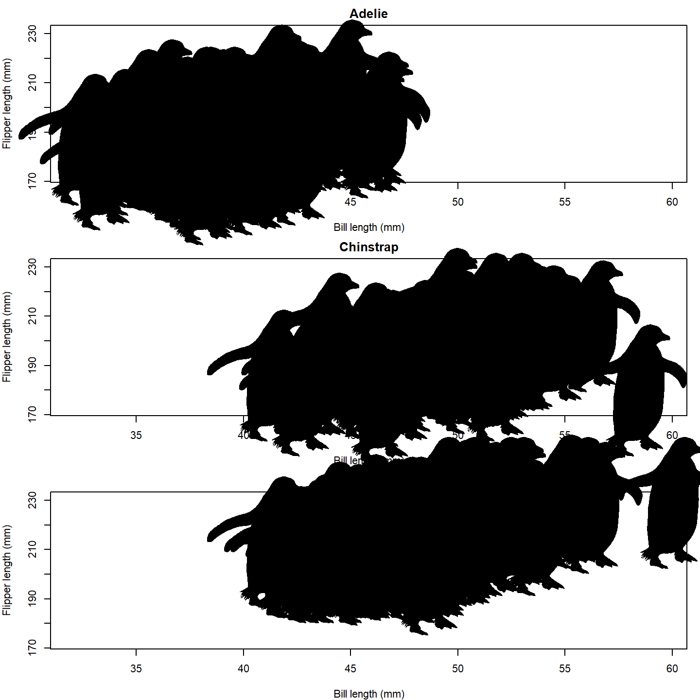
plot of chunk base-penguin-plot-3
Oh no, the silhouettes are way too big! The default for
add_phylopic_base() is to make the silhouette the same
height as the plot, which is way too big for our case here. Let’s make
the size of the silhouettes relative to the penguins’ body masses. A
scaling factor of 8 seems to work well for this size figure.
par(mfrow = c(3, 1), mar = c(4, 4, 2, 1))

for (i in seq_along(species_split)) {
  species_data <- species_split[[i]]
  plot(NA, xlab = "Bill length (mm)", ylab = "Flipper length (mm)",
       main = names(species_split)[i],
       xlim = range(penguins_subset$bill_length_mm, na.rm = TRUE),
       ylim = range(penguins_subset$flipper_length_mm, na.rm = TRUE))
  add_phylopic_base(img = penguin_rot,
                    x = species_data$bill_length_mm,
                    y = species_data$flipper_length_mm,
                    height = species_data$body_mass_g /
                      max(penguins_subset$body_mass_g, na.rm = TRUE) * 8)
}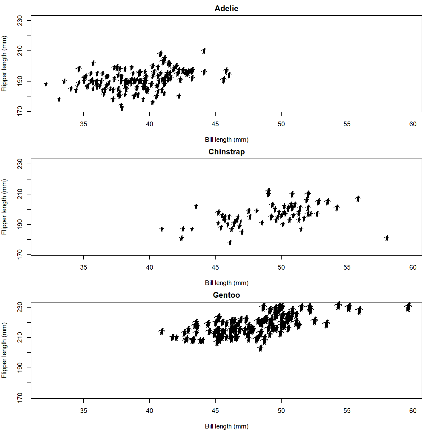
plot of chunk base-penguin-plot-4
Finally, let’s give the female and male penguins different fill colors. We’ll also add a legend to the last panel.
par(mfrow = c(3, 1), mar = c(4, 4, 2, 1))

for (i in seq_along(species_split)) {
  species_data <- species_split[[i]]
  plot(NA, xlab = "Bill length (mm)", ylab = "Flipper length (mm)",
       main = names(species_split)[i],
       xlim = range(penguins_subset$bill_length_mm, na.rm = TRUE),
       ylim = range(penguins_subset$flipper_length_mm, na.rm = TRUE))
  add_phylopic_base(img = penguin_rot,
                    x = species_data$bill_length_mm,
                    y = species_data$flipper_length_mm,
                    height = species_data$body_mass_g /
                      max(penguins_subset$body_mass_g, na.rm = TRUE) * 8,
                    fill = ifelse(species_data$sex == "male", "blue", "orange"))
}

# Add a legend to the last plot
legend("bottomright", legend = c("Female", "Male"), pch = 20,
       col = c("orange", "blue"), bty = "n")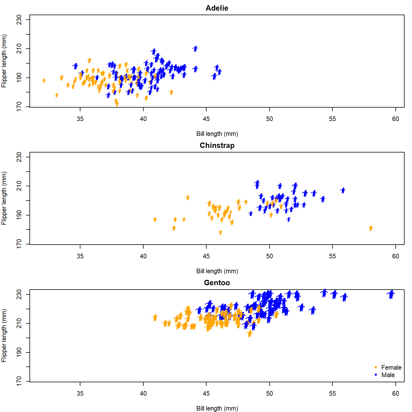
plot of chunk base-penguin-plot-5
Now that’s a nice figure!
Geographic distribution
In much the same way as generic x-y plotting, the rphylopic package can be used in base R to plot organism silhouettes on a map. That is, to plot data points (e.g., species occurrences) as silhouettes. We provide an example here of how this might be achieved. For this application, we use the example occurrence dataset of early (Carboniferous to Early Triassic) tetrapods from the palaeoverse R package to visualize the geographic distribution of Diplocaulus fossils.
First, let’s load our libraries and the tetrapod data:
# Load libraries
library(rphylopic)
library(maps)
library(palaeoverse)
# Get occurrence data
data(tetrapods)
Then we’ll subset our occurrences to only those for Diplocaulus:
# Subset to desired group
tetrapods <- subset(tetrapods, genus == "Diplocaulus")
Now, let’s plot those occurrences on a world map. Here we use the
geodata and raster packages to generate
the map. Then we add colored points on top of this. Note that we use
alpha = 0.75 in case there are multiple occurrences in the
same place. That way, the darker the color, the more occurrences in that
geographic location.
# Plot map
map("world", col = "lightgrey", fill = TRUE)
# Plot points
points(x = tetrapods$lng, y = tetrapods$lat, cex = 2, pch = 16,
       col = rgb(red = 0, green = 0, blue = 1, alpha = 0.75))
plot of chunk base-geog-plot-1
Now, as with the penguin figure above, we can easily replace those points with silhouettes.
map("world", col = "lightgrey", fill = TRUE)
add_phylopic_base(name = "Diplocaulus", x = tetrapods$lng, y = tetrapods$lat,
                  height = 8, fill = "blue", alpha = 0.75)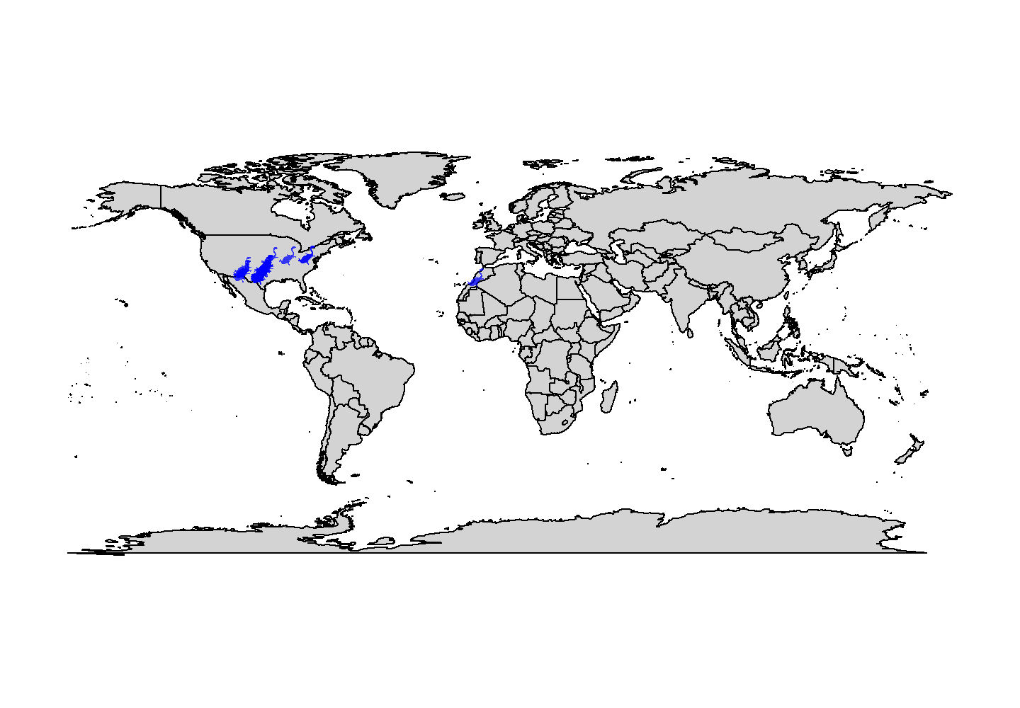
plot of chunk base-geog-plot-2
Snazzy!
Note that we used the genus name as the name argument
here. However, if we were plotting occurrences of multiple genera, we’d
definitely want to plot them as different silhouettes using
name = tetrapods$genus.
Phylogenetics
Another common use case of PhyloPic silhouettes is to represent taxonomic information. In this example, we demonstrate how to use silhouettes within a phylogenetic framework. In this case, the phylogeny, taken from the phytools package, includes taxa across all vertebrates. Even many taxonomic experts are unlikely to know the scientific names of these 11 disparate taxa, so we’ll replace the names with PhyloPic silhouettes. First, let’s load our libraries and data:
# Load libraries
library(rphylopic)
library(ggplot2)
library(phytools)
# Get vertebrate phylogeny and data
data(vertebrate.tree)
We can use a vectorized version of the get_uuid()
function to retrieve UUID values for all of the species at once.
However, just in case we get an error, we wrap the
get_uuid() call in a tryCatch() call. This
way, we should get either a UUID or NA for each
species:
# Make a data.frame for the PhyloPic names
vertebrate_data <- data.frame(species = vertebrate.tree$tip.label, uuid = NA)
# Try to get PhyloPic UUIDs for the species names
vertebrate_data$uuid <- sapply(vertebrate.tree$tip.label,
                               function(x) {
                                 tryCatch(get_uuid(x), error = function(e) NA)
                               })
vertebrate_data
## species uuid
## 1 Carcharodon_carcharias 00f208a3-887d-4ae8-838c-2124f53b9fc1
## 2 Carassius_auratus abcb9d2c-db21-4b63-b8e7-b770b11ad288
## 3 Latimeria_chalumnae 12c38a8a-6d68-4af3-ada3-05cafdfc25c2
## 4 Homo_sapiens 9c6af553-390c-4bdd-baeb-6992cbc540b1
## 5 Lemur_catta 8a187391-82a3-4d9b-a402-3a310bf7dc38
## 6 Myotis_lucifugus <NA>
## 7 Sus_scrofa 14a64a2f-166e-4bb4-b108-adc085cbcb7a
## 8 Megaptera_novaeangliae 012afb33-55c3-4fc6-9ae3-3a91fda32fd5
## 9 Bos_taurus dc5c561e-e030-444d-ba22-3d427b60e58a
## 10 Iguana_iguana 5dec03d9-66a2-4033-b1a9-6dbb3485199f
## 11 Turdus_migratorius 83b29bf0-f4f9-412d-8b3b-7faf4febd69dOh no, we weren’t able to find a silhouette for Myotis
lucifugus (little brown bat)! Good thing we used
tryCatch()! Given the coarse resolution of this phylogeny,
we can just grab a silhouette for the subfamily (Vespertilioninae):
vertebrate_data$uuid[vertebrate_data$species == "Myotis_lucifugus"] <-
  get_uuid("Vespertilioninae")
I’m also not a huge fan of the boar picture. Let’s choose an
alternative with pick_phylopic().
# Pick a different boar image; we'll pick #2
boar_svg <- pick_phylopic("Sus scrofa", view = 5)
# Extract the UUID
vertebrate_data$uuid[vertebrate_data$species == "Sus_scrofa"] <-
  attr(boar_svg, "uuid")
Now that we’ve got our phylogeny and UUIDs, we could go ahead and
create our figure. However, time for a quick aside. The time required
for add_phylopic_base() and the other
rphylopic visualization functions scales with the
number of unique names/UUIDs, not the number of plotted
silhouettes. Therefore, if you are plotting a lot of different
silhouettes, these functions can take quite a long time to poll PhyloPic
for each unique name, download the silhouettes, and convert them to be
added to the plot. If you plan to use the same silhouettes for multiple
figures, we strongly suggest that you poll PhyloPic yourself using
get_phylopic() or pick_phylopic(), save the
silhouettes to your R environment, and then these use image objects in
the visualization functions (with the img
argument/aesthetic). Following this advice, let’s get image objects for
these 11 species before we make our figure. Note that, since we’ve used
get_uuid() to get these 11 UUIDs, we know that they are
valid, so we don’t need to catch any errors this time.
vertebrate_data$svg <- lapply(vertebrate_data$uuid, get_phylopic)Now let’s go ahead and plot our phylogeny with the ape package:
plot of chunk base-phylo-plot-1
Hmm…that’s a bit boring. Let’s add a geological timescale to the
bottom using axis_geo_phylo() from the
palaeoverse package.
library(palaeoverse)
# Plot the tree with a geological timescale on the bottom
plot(vertebrate.tree)
axis_geo_phylo(intervals = "periods")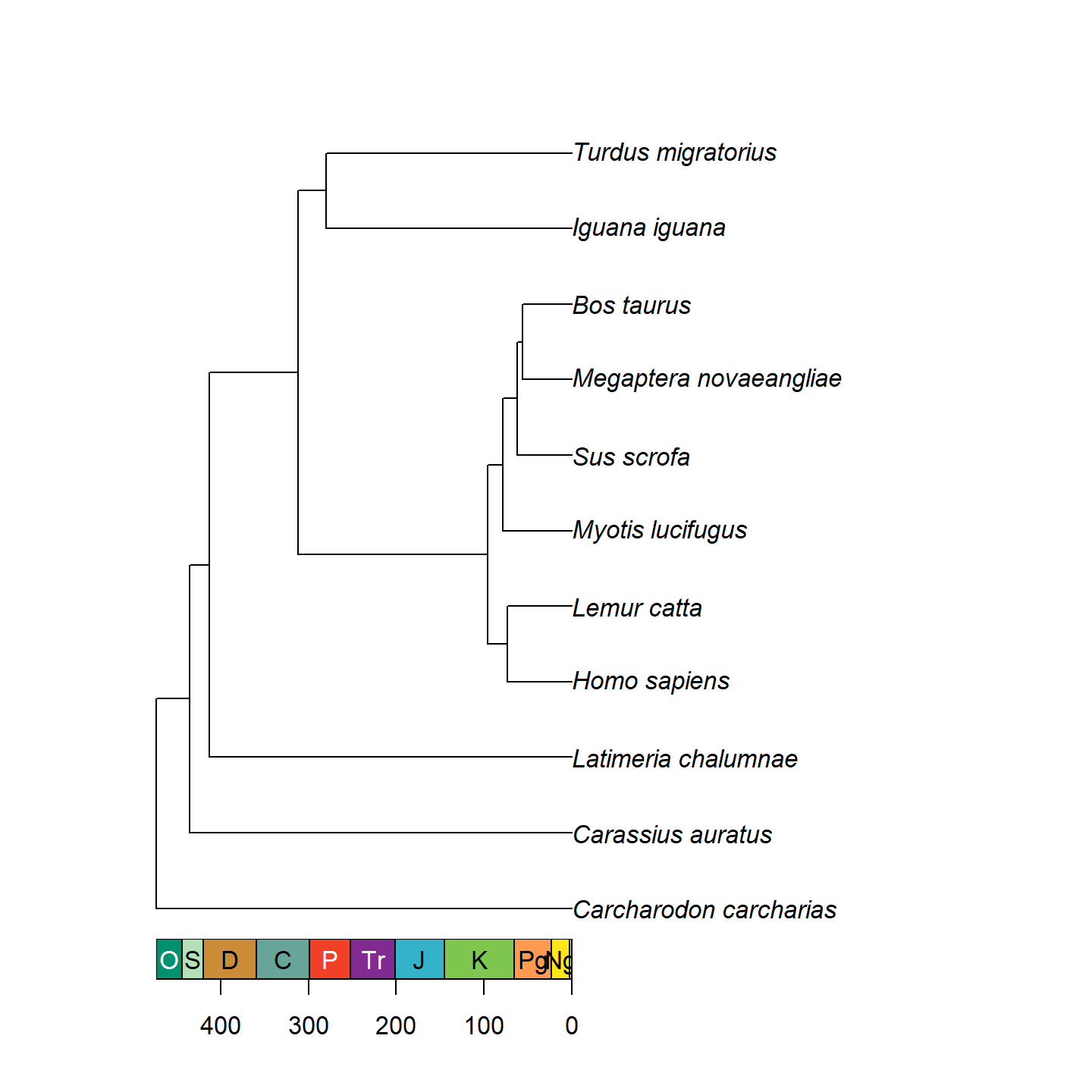
plot of chunk base-phylo-plot-2
That’s looking a lot prettier! Let’s go ahead and replace the tip
labels with our silhouettes now using add_phylopic_tree()
(a wrapper of add_phylopic_base() for phylogenetic trees).
Note that while it may look like all of the tips have an x-axis value of
0, that’s actually a trick from axis_geo_phylo(). In
reality, the left end of the x-axis is 0, and the right end of the
x-axis is the total height of the tree. Fortunately,
add_phylopic_tree() figures out the x and y coordinates for
the silhouettes for us, so we don’t have to worry about doing any funny
math.
plot(vertebrate.tree, show.tip.label = FALSE)
axis_geo_phylo(intervals = "periods")
add_phylopic_tree(vertebrate.tree, tip = vertebrate_data$species,
                  img = vertebrate_data$svg, height = 0.5, width = NULL,
                  padding = 0, hjust = 0.5)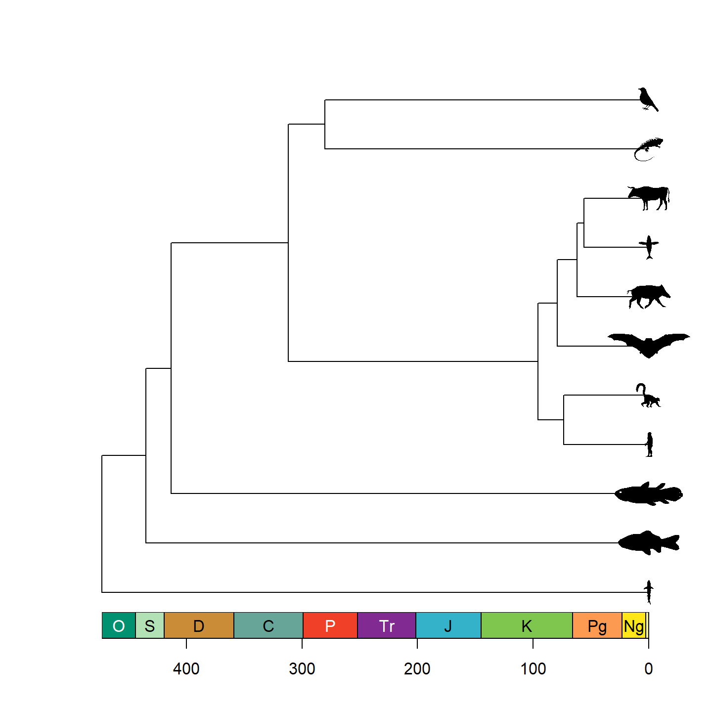
plot of chunk base-phylo-plot-3
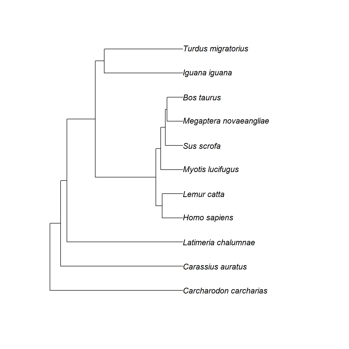
Note that only a single size is specified and aspect ratio is always maintained, hence why the silhouettes all have the same height but different widths. Let’s fix some of the silhouettes by rotating them 90 degrees:
vertebrate_data$svg[[1]] <- rotate_phylopic(img = vertebrate_data$svg[[1]])
vertebrate_data$svg[[8]] <- rotate_phylopic(img = vertebrate_data$svg[[8]])
And now the finished product:
plot(vertebrate.tree, show.tip.label = FALSE)
axis_geo_phylo(intervals = "periods")
add_phylopic_tree(vertebrate.tree, tip = vertebrate_data$species,
                  img = vertebrate_data$svg, height = 0.5, width = NULL,
                  padding = 0, hjust = 0.5)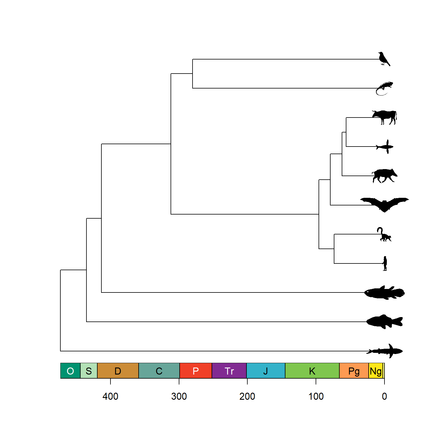
plot of chunk base-phylo-plot-4
Beautiful!
Network plots
The rphylopic package also integrates directly with
the igraph package for plotting networks in base R. When
both packages are loaded, rphylopic registers a custom
igraph vertex shape called "phylopic" that
can be used in calls to plot() on an igraph
graph via vertex.shape = "phylopic". Each phylopic-related
parameter from add_phylopic_base() is exposed as a
corresponding vertex.* argument (e.g.,
vertex.name, vertex.uuid,
vertex.color, vertex.angle).
Let’s demonstrate with a simple Permian food web. First, we set up the network:
# Load libraries
library(rphylopic)
library(igraph)
# Define the same Permian tetrapod food web
food_web <- data.frame(
  from = c("Eryops", "Diplocaulus", "Diplocaulus", "Eryops"),
  to   = c("Dimetrodon", "Dimetrodon",
           "Xenacanthus decheni", "Xenacanthus decheni")
)
g <- graph_from_data_frame(food_web, directed = TRUE)
layout <- layout_with_fr(g)
We can now render the graph with PhyloPic silhouettes as the nodes.
The vertex names from V(g)$name are passed to the
vertex.name argument, which rphylopic uses
to look up silhouettes:
plot(g, layout = layout,
     vertex.shape = "phylopic",
     vertex.name = V(g)$name,         # taxonomic names from the graph
     vertex.size = 100,
     vertex.label = NA,               # silhouettes replace text labels
     edge.arrow.size = 0.5,
     xlim = c(-0.5, 0.5), ylim = c(-0.5, 0.5),
     asp = 0)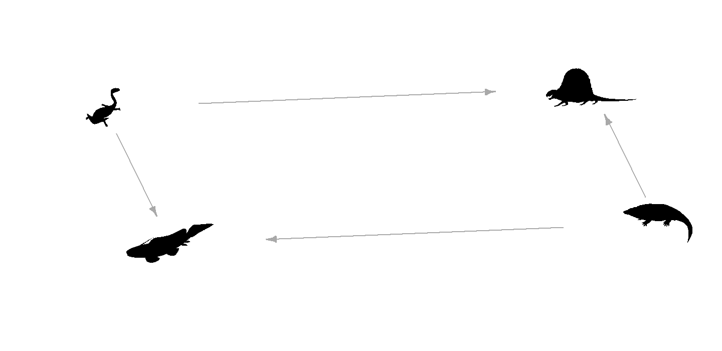
plot of chunk base-network-plot-1
Most of the customization options from
add_phylopic_base() are also available via the
vertex.* arguments. For example, here we color each
silhouette differently and apply a small rotation:
plot(g, layout = layout,
     vertex.shape = "phylopic",
     vertex.name = V(g)$name,
     vertex.size = 100,
     vertex.color = rainbow(vcount(g)),  # per-vertex fill color
     vertex.angle = 15,                  # rotate all silhouettes 15 degrees
     vertex.label = NA,
     edge.arrow.size = 0.5,
     xlim = c(-0.5, 0.5), ylim = c(-0.5, 0.5),
     asp = 0)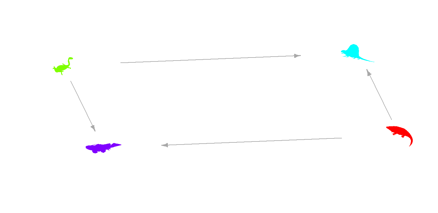
plot of chunk base-network-plot-2